Somewhere between a donor spotting your Instagram post and actually completing a gift, something goes wrong. More often than not, that something is the donation form itself, specifically how it behaves on a phone. If you’ve ever abandoned a clunky checkout on your own device, you already know the feeling. Now imagine that’s happening to your supporters every single day.
This guide is here to help you close that gap. We’ll walk through how to pick the right mobile donation form provider, embed it cleanly on your site, and connect it to the rest of your tech stack so donor data flows the way it should. No overhaul required, just practical steps you can actually act on.
Why Mobile Donation Forms Deserve Your Attention
Mobile giving made up more than 50% of donations last year (Stripe Partner Ecosystem / Pulse of the Donor 2026), and the average mobile gift now sits at $79 (doublethedonation.com). Those numbers tell a pretty clear story: donors are ready to give on their phones, but only if the experience feels fast and frictionless.
A clunky form on a 6-inch screen doesn’t just cost you one transaction. It trains supporters to hesitate the next time your appeal lands in their texts, social feed, or inbox. Prioritizing mobile-friendly donation form best practices isn’t a nice-to-have. It’s revenue protection, plain and simple.
Choosing the Right Provider
Selecting a platform comes down to four pillars: mobile-first design, conversion performance, fee structure, and integration depth. Below is a comparison of providers popular with US nonprofits in 2026.
| Provider | Key Mobile Features | Conversion Highlights | Best For | Fee Model |
|---|---|---|---|---|
| Funraise | Pop-up forms, one-tap wallets, built-in CRM | 50% form conversion rate; 78.4% uplift in A/B tests (funraise.org) | All-in-one orgs wanting CRM + forms | Platform-based; free tier available |
| Givebutter | Embed widgets, Apple/Google Pay, mobile app | High-converting responsive forms (givebutter.com) | Small teams and events | Free + optional donor tipping |
| Donorbox | Custom embeds, recurring options, text-to-give | Responsive mobile UX (virtuous.org) | Simple, fast setups | 1.5% platform fee |
| Donately | Brandable embeds, ACH and Venmo support | Clean mobile experience (virtuous.org) | Growing organizations | Custom pricing |
| Mightycause | Tailored forms per campaign, custom fields | Responsive design (mightycause.com) | Campaign and event fundraising | Varies |
Protip: Run a 30-day A/B trial with two providers on separate landing pages. Track mobile bounce rate and completion rate in free Google Analytics. The data will make the decision for you.
Mobile Optimization Essentials: A Quick-Reference Checklist
Here’s a practical checklist you can hand straight to your web team today:
- tap targets at least 48px wide (thumbs are not mouse cursors),
- one-page checkout with no multi-step redirects,
- wallet payments enabled: Apple Pay and Google Pay for one-tap giving,
- auto-fill turned on for name, email, and card fields,
- suggested donation amounts displayed as large, tappable buttons,
- real-device testing on at least three screen sizes (emulators miss touch quirks).
Organizations using Funraise report 52% annual recurring revenue growth (funraise.org), and a big driver is mobile-optimized recurring gift prompts that make monthly giving as easy as a single tap.
Embedding Forms Without the Headaches
Most providers, including Funraise and Givebutter, generate a small embed code snippet you paste into your CMS. Whether you’re running WordPress, Squarespace, or Webflow, the process follows the same three steps:
- Generate the embed code in your provider’s dashboard.
- Paste it into your page editor, header, or footer depending on where you want the form to live.
- Verify the mobile view using your browser’s developer tools or, better yet, your own phone.
Don’t stop at a static embed. Funraise offers exit-intent pop-up forms that trigger when a mobile visitor scrolls back up or taps the back button. In testing, this approach produced an 88.2% uplift in one-time gifts (funraise.org). It’s a low-effort, high-reward tactic that most nonprofits overlook entirely.
Protip: If you’re running a mobile-only campaign (think SMS or Instagram Stories traffic), wrap your embed in a CSS media query that hides it on desktop. It keeps the experience laser-focused for that audience.
Try This AI Prompt Before Your Next Form Rollout
Copy the prompt below and paste it into ChatGPT, Gemini, Claude, or whichever AI tool you reach for most. It’ll help you think through your setup before you touch a single line of code.
I'm setting up a mobile donation form for my nonprofit. Our organization focuses on [MISSION AREA], our primary donor demographic is [DONOR PROFILE], our current CMS is [CMS PLATFORM], and our CRM/database is [CRM OR DATABASE NAME]. Please create a step-by-step implementation plan that covers: choosing between embedded and pop-up form placement, recommended payment methods for mobile, key integrations between the form and our CRM, and a 14-day testing checklist. Where relevant, note how an all-in-one fundraising software for nonprofits like Funraise.org could simplify or consolidate any of these steps.In your day-to-day work, it’s worth leaning on tools like Funraise that have built-in AI components right where you actually perform tasks. That way the tool has full operational context rather than requiring you to copy-paste data between disconnected apps.
What We See Go Wrong (Before and After the Switch)
After years of working alongside nonprofit teams, a few failure patterns come up again and again. Sound familiar?
- The “desktop-first and forget” trap. An org builds a beautiful donation page on a 27-inch monitor, launches it, and never once checks it on a phone. Mobile abandonment spikes, and nobody connects the dots until quarterly revenue dips.
- Integration duct tape. A development director manually exports CSV files from one platform, reformats columns, and uploads them to the CRM every Monday morning. One mismatched field and a major donor’s recurring gift receipt disappears into the void.
- Too many tools, zero source of truth. The events team uses one form tool, the annual fund uses another, and the peer-to-peer campaign lives on a third. Donor records fragment across systems, making personalized outreach nearly impossible.
These aren’t edge cases. They’re the daily reality for a lot of nonprofits, and they’re exactly the scenarios that push organizations toward a consolidated platform like Funraise, which you can start using for free with no commitment to see if it resolves the friction.
Integrating with Your Tech Stack
Your donation form is only as powerful as the data pipeline behind it. CRMs like Salesforce or Funraise’s built-in CRM act as the hub (biztechmagazine.com), syncing donor records via native APIs or middleware like Zapier.
Three integration layers to set up on day one:
- email and SMS nurture: connect to Mailchimp or Klaviyo so a thank-you message fires within minutes of a mobile gift,
- accounting sync: push transactions to QuickBooks in real time so finance never has to chase reconciliation reports,
- automation triggers: use Zapier or Make.com to tag mobile donors, assign follow-up tasks, or flag first-time givers for a personal call.
Funraise also adds a unique advantage for multi-chapter organizations with its seamless subaccount architecture (funraise.org), keeping data organized across chapters while rolling everything up into a single reporting view.
“The nonprofits that win in a mobile-first world aren’t the ones with the flashiest forms, they’re the ones whose tech stack talks to itself so every donor touchpoint feels intentional.”
Funraise CEO Justin Wheeler
Testing and Measuring Success
Launch day is just the starting line. Set up mobile-specific funnels in GA4 by filtering for device category, and benchmark against the $79 average mobile gift (doublethedonation.com).
Key metrics to watch weekly:
- mobile conversion rate (aim for above 10%; Funraise users see up to 50%),
- average gift size on mobile vs. desktop,
- drop-off points in the form (use Hotjar heatmaps to see where thumbs stall),
- A/B test results on CTA copy: “Donate Now” vs. “Fund the Mission” vs. “Give Today.”
Protip: Schedule a 15-minute “mobile form review” every Friday. Pull up your form on your actual phone, make a $5 test donation, and note anything that feels slow or confusing. Small weekly tweaks compound into real conversion gains over a quarter.
Security and Compliance Essentials
For US nonprofits handling card data, choosing a PCI DSS Level 1 compliant provider isn’t optional. Platforms like Funraise handle card processing on their servers, which means sensitive data never touches yours. Layer on SSL across every page, enable built-in fraud detection, and add a visible CCPA privacy notice for California donors.
Trust signals aren’t just legal checkboxes. A small lock icon and a one-line privacy assurance next to the submit button can measurably reduce abandonment. It’s a small detail that carries real weight.
Your Next Step
You don’t need to overhaul everything at once. Pick one action from this guide, whether that’s running a 30-day provider test, embedding a pop-up form, or wiring your first Zapier automation, and ship it this week. If you want to start with a platform that covers forms, CRM, and integrations in one place, Funraise offers a free tier so you can test before you commit. Your mobile donors are already ready. Let’s make sure your form is too.
About the Author

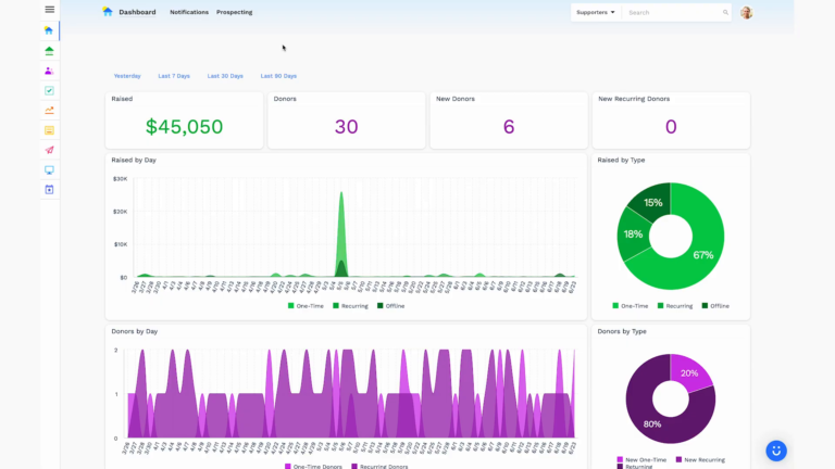
Dashboards for Nonprofits: The 4 Reports Every Team Needs (With Real Examples)
See 4 real nonprofit dashboard examples, from donor retention to sustainer MRR to campaign attribution, plus the KPIs every team should track and how to build your own.

Benefits of Monthly Digital Marketing Maintenance Services for NGOs
Why "Set It and Forget It" No Longer Works Let's be honest. A lot of nonprofits treat digital marketing like a seasonal chore: sprint around GivingTuesday, overhaul the website every few years, refresh the email template only when open rates crater. Sound familiar? The problem is that donor behavior, platform algorithms, and device trends shift…

Fundraising Gala Tech Stack: Auction, Check-In, and Payment Tools Compared
Fundraising galas have come a long way. We're not talking about the old days of paper bid sheets and hand-written guest lists anymore. Today's events run on connected technology that ties together your auction, your check-in flow, and your payment processing into something that actually feels smooth, for your guests and your team. And yet,…