Most nonprofits treat reporting like a chore. Someone on the finance team runs an export when the auditor asks for it, a board member requests “the numbers” before a quarterly meeting, and everyone scrambles to assemble a deck that describes what already happened. Sound familiar?
Here is the mindset shift worth making: reporting is not about the past. It is about the future. A good dashboard does not just tell you what your fundraising did last quarter, it tells you what to do next week. We recently sat through a webinar led by Tony Sasso, co-founder and chief product officer at Funraise, where he made this case better than we have heard anyone make it, then walked through the exact dashboards nonprofits should be running. This post distills that walkthrough into something you can act on, with real screenshots from the platform.
If technology usually feels like the thing standing between your team and its mission, this is one of the rare cases where the right setup pays you back every single week. Let’s get into it.
Why Most Nonprofit Reporting Is Pointed the Wrong Direction
Think about a timeline with your organization sitting right in the middle. The past is a single fixed line, it already happened. The future is a wide cone that could go up, down, or sideways. Your accountant and your auditor care about that fixed line behind you. Your board cares about the cone in front of you: how wide is it, and how do we narrow it?
That is the whole game. When you have a live dashboard showing what is actually happening on the ground right now, you shrink that cone of uncertainty. You can rule out the worst-case bottom bound because the data says it is no longer possible, and you can make confident decisions about the realistic range that remains. As Tony put it, data lets you “move opinions out of the room.” You stop responding to the loudest person at the table and start responding to what is actually happening.
The deeper reframe is this: your data is an organizational asset, just like the funds donors give you, your equipment, and your people. Wasting it is no different from mishandling a donation. Most small and mid-sized nonprofits do not lack data, they lack a way to see it. It ends up buried in annual spreadsheets on someone’s hard drive instead of informing the next decision.
And here is the encouraging part. You do not need a data scientist to benefit from this. Humans are exceptional at pattern recognition. Once a number is on a dashboard, once it is visible, everyone in the room can spot the trend and contribute. The skill is not in reading the chart, it is in building it. That is the part good software should handle for you.
Protip: Nonprofits that use Funraise’s fundraising intelligence tools see a 12% better donor retention rate on average. That gap is the whole argument for future-facing dashboards in a single number, retention improves when teams can actually see who they are losing while there is still time to act.
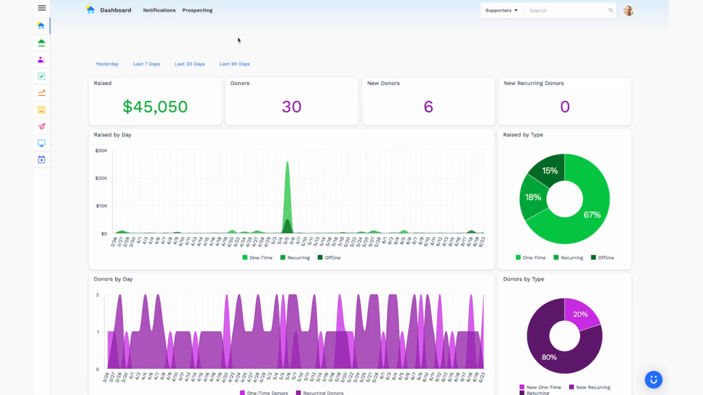
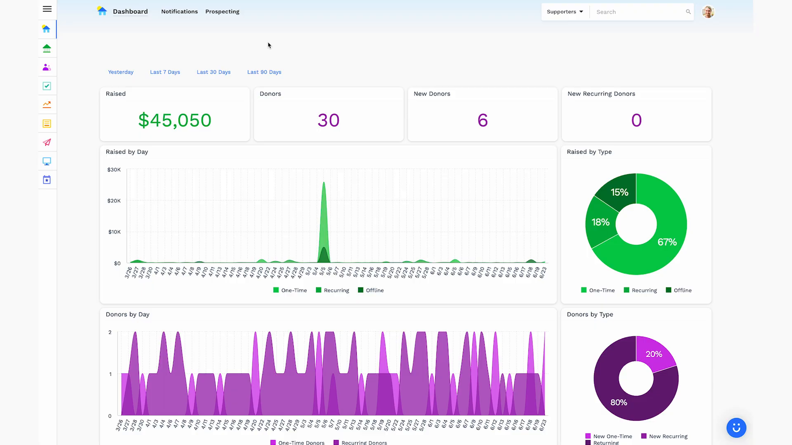
When you first log into a platform like Funraise, this is the kind of view that greets you: a live snapshot of money raised, donors, new donors, and new recurring donors, with the year-over-year trend built right in. It is not a report someone had to assemble. It is always on.
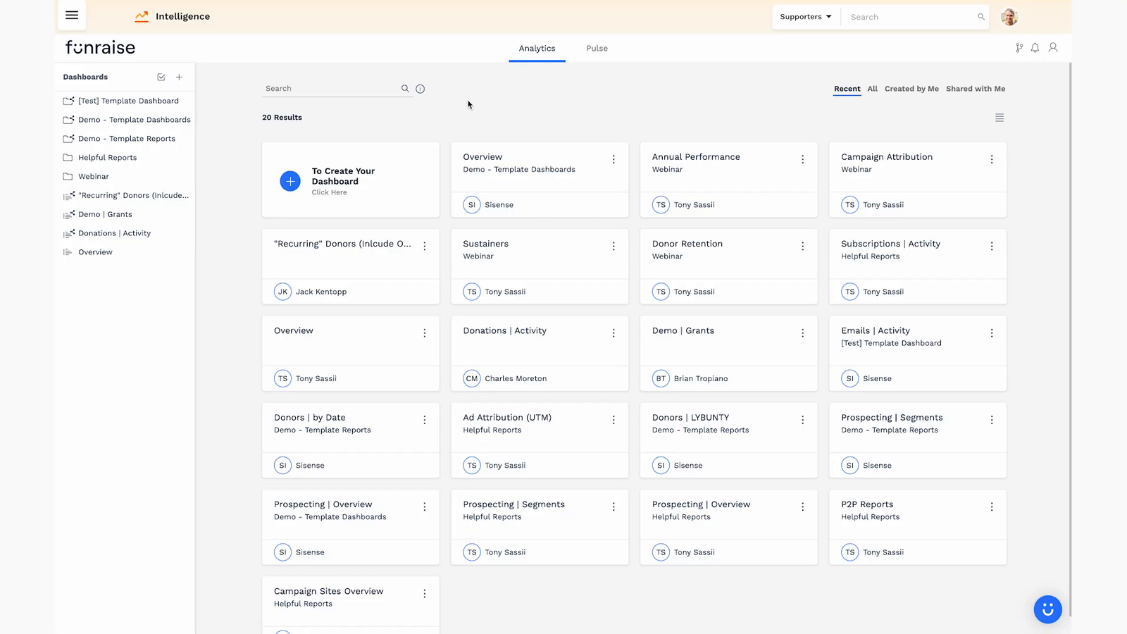
From there, the real power shows up when you move into purpose-built dashboards. A mature setup keeps a small library of saved dashboards, each answering a different strategic question, so nobody is rebuilding the same view every month.
The 4 Nonprofit Dashboards Every Team Should Have
You could build a hundred different dashboards. But in the webinar, Tony argued that four are essentially required for any organization. If you build nothing else, build these.
1. The Annual Performance Snapshot
This is the dashboard you pull up the instant a board member or executive asks “how are we doing?” It should never be built on the spot. It exists, it stays current, and ideally it lands in your inbox on a schedule. In a nutshell, this is your quarterly board review, ready at any moment.
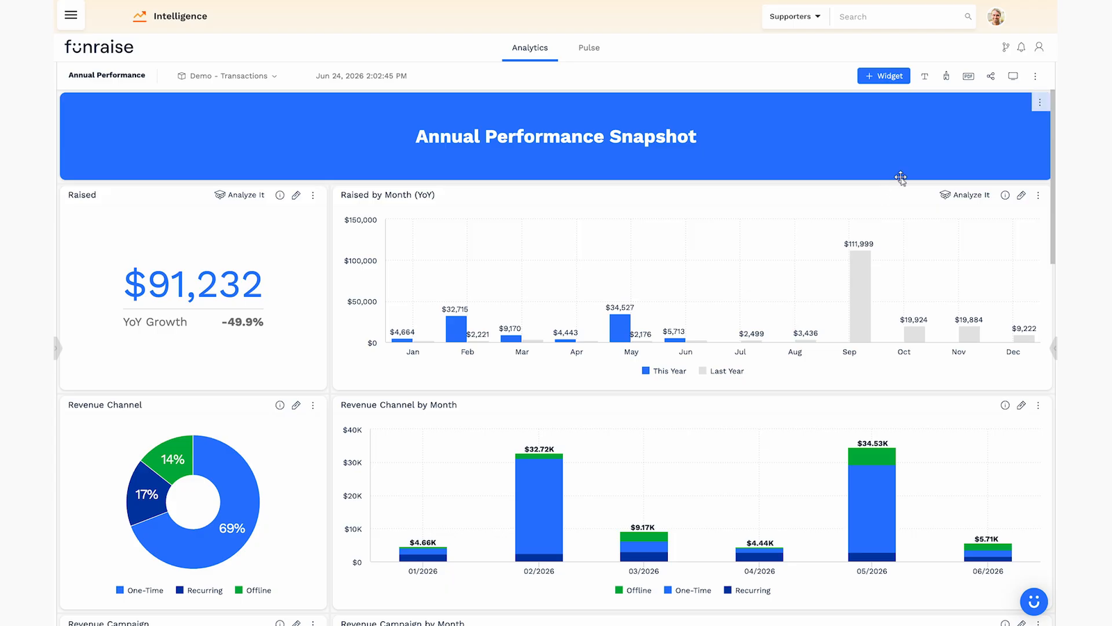
What belongs on it? Start with how much you have raised and the change from last year, but never look at a raw annual number in isolation. Fundraising is intensely seasonal, so break revenue down month over month and compare it to the same month last year. A single “$91,000 raised” tells you almost nothing until you see it as a monthly line running above or below where you were a year ago.
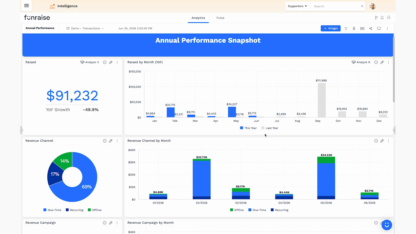
Layer in the revenue mix by channel (one-time, recurring, and offline) and by campaign. When a month suddenly loses all its one-time online gifts and shifts entirely to offline, that is not a curiosity, it is a signal that your website or your traffic broke. Add your new-donor mix, your pledged revenue pipeline for cash-flow planning, your monthly recurring revenue (MRR), and a lapsed-donor count. Together these answer the executive question, “what is our realistic range for the rest of the year, and where do we steer?”
2. The Donor Retention Dashboard
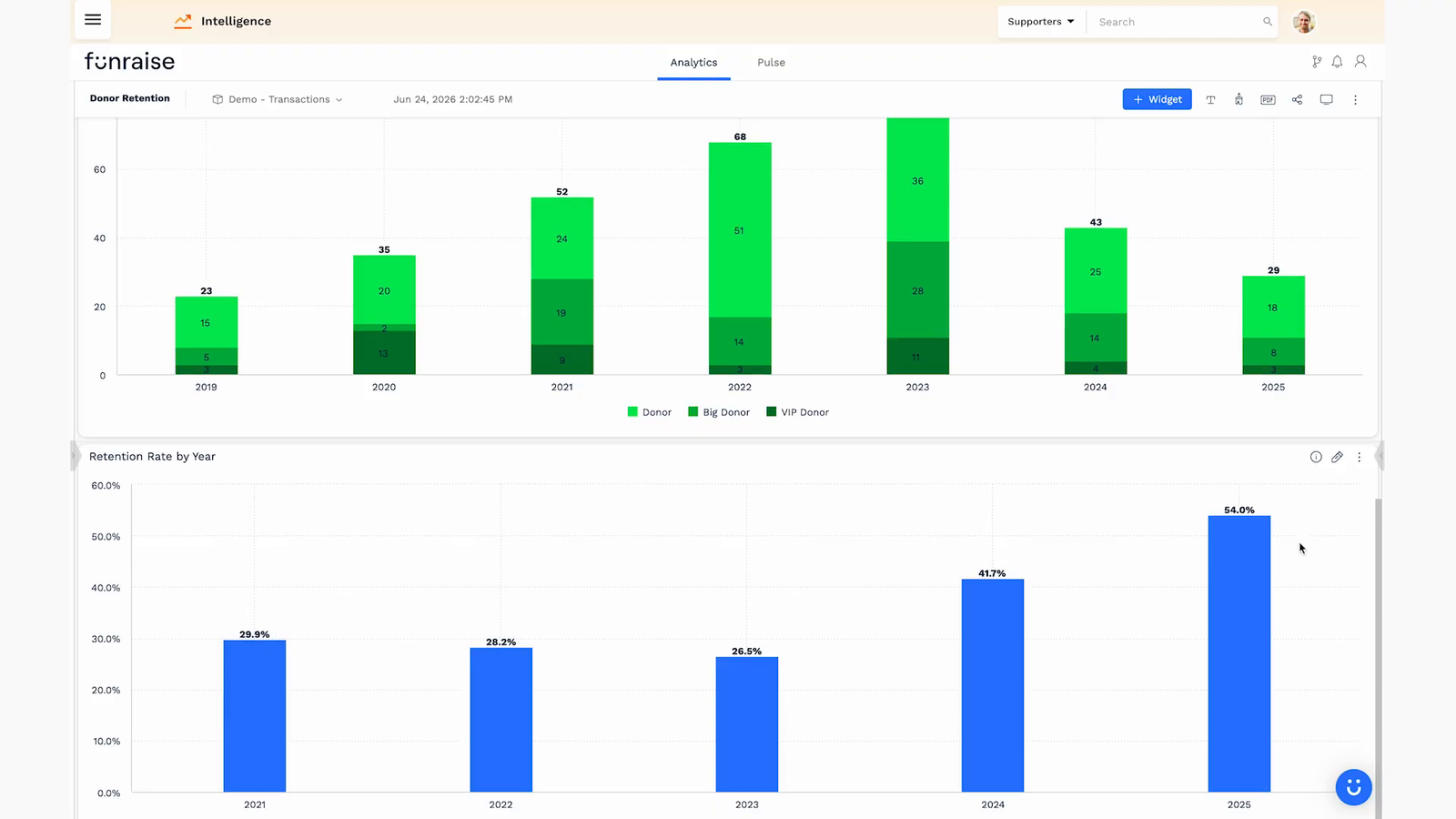
Donor retention for most nonprofits hovers around 50%. If you are north of that, you are beating the average, and there is still enormous room. Winning back a donor who already understands and cares about your mission is the single most efficient path to more revenue you have. But you cannot win them back if you cannot see them.
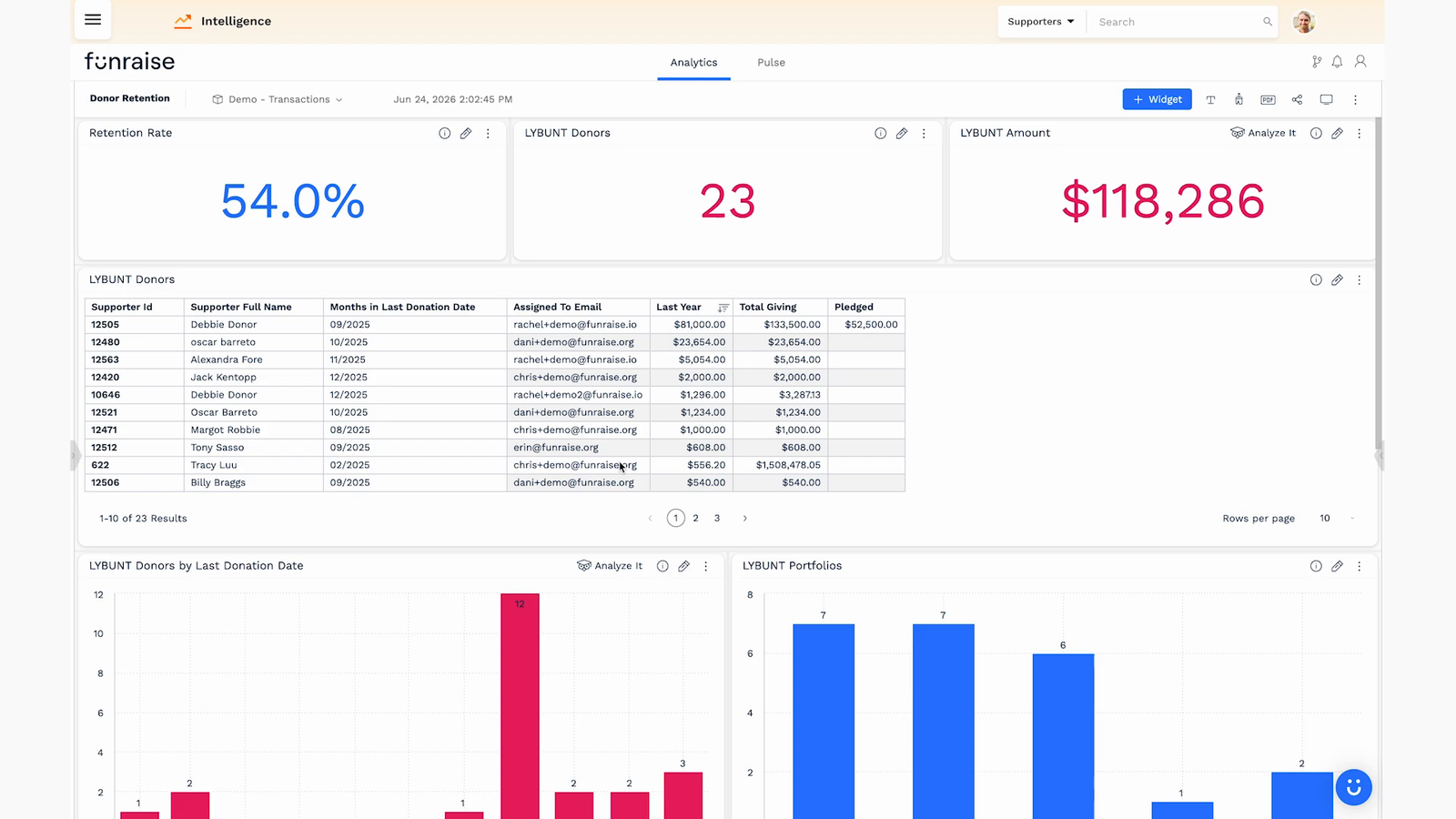
A strong retention dashboard shows your retention rate, how many donors you lost from last year, and, the number that gets executives to act, how much revenue those lost donors represent. If 23 lapsed donors add up to more than $100,000 in prior giving, “donor retention” stops being an abstraction. Below the headline numbers, put a real LYBUNT list (Last Year But Unfortunately Not This year) with each supporter’s last gift date, who on your team owns the relationship, and their total giving so you know who to prioritize.
Then get smarter about focus. Break lapsed donors down by the month you lost them (a January lapse is more urgent than a December one that is simply due to renew), by the portfolio owner responsible, and by donor tier. Segmenting your SYBUNT donors into regular, big, and VIP tiers lets you route VIPs to your executive director for a personal conversation and hand the rest to your general development team, instead of spreading everyone thin across one giant undifferentiated list.
3. The Sustainer Health Dashboard
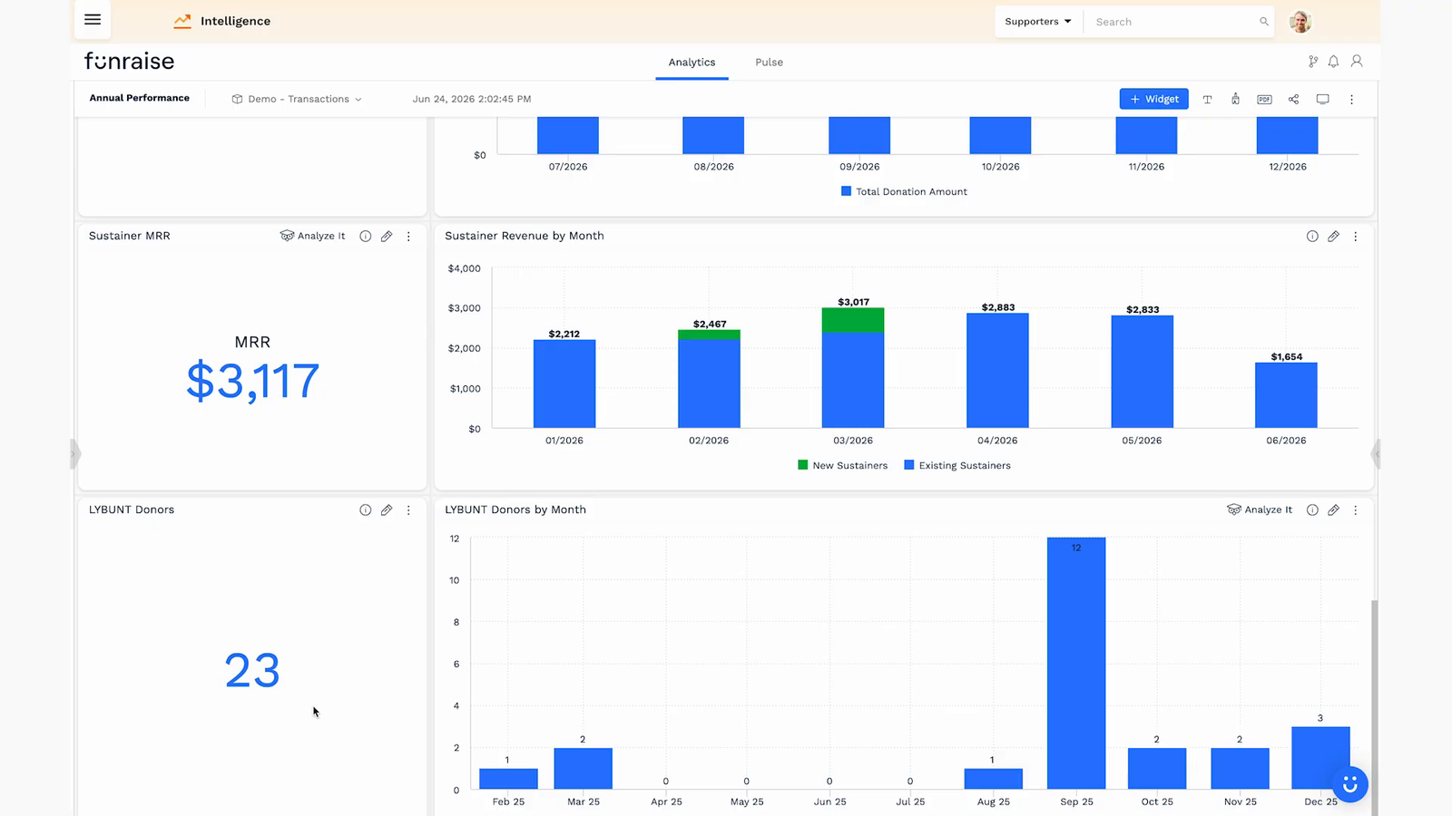
Recurring giving is the closest thing a nonprofit has to predictable revenue, so it deserves its own dashboard. The problem with a monthly giving program is that its impact is hard to feel one signup at a time. A dashboard makes the snowball visible.
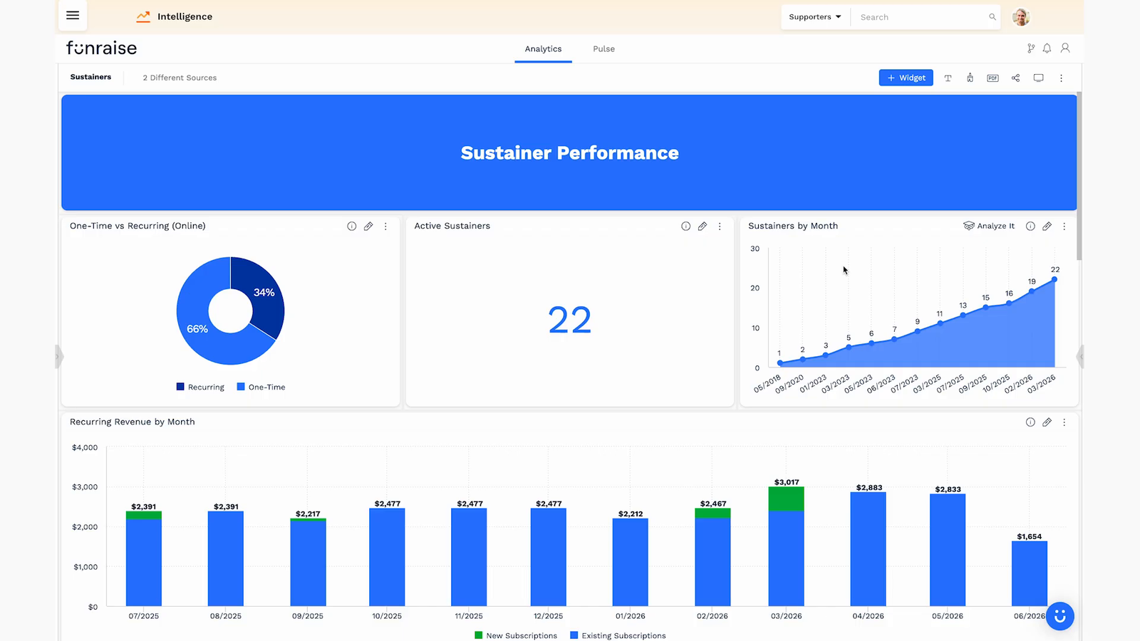
Put your one-time versus recurring mix on it (many healthy programs land between 20% and 25% recurring), your active sustainer count, and a running sum of sustainers over time. That running total is quietly motivating because it accounts for churn and still trends up, proving you are gaining faster than you are losing. Add recurring revenue by month and active MRR, so your executive team knows exactly how much they can count on arriving every month. New MRR is the exciting one: $255 gained in a single month is not a one-time gift, it is $255 that recurs every month going forward.
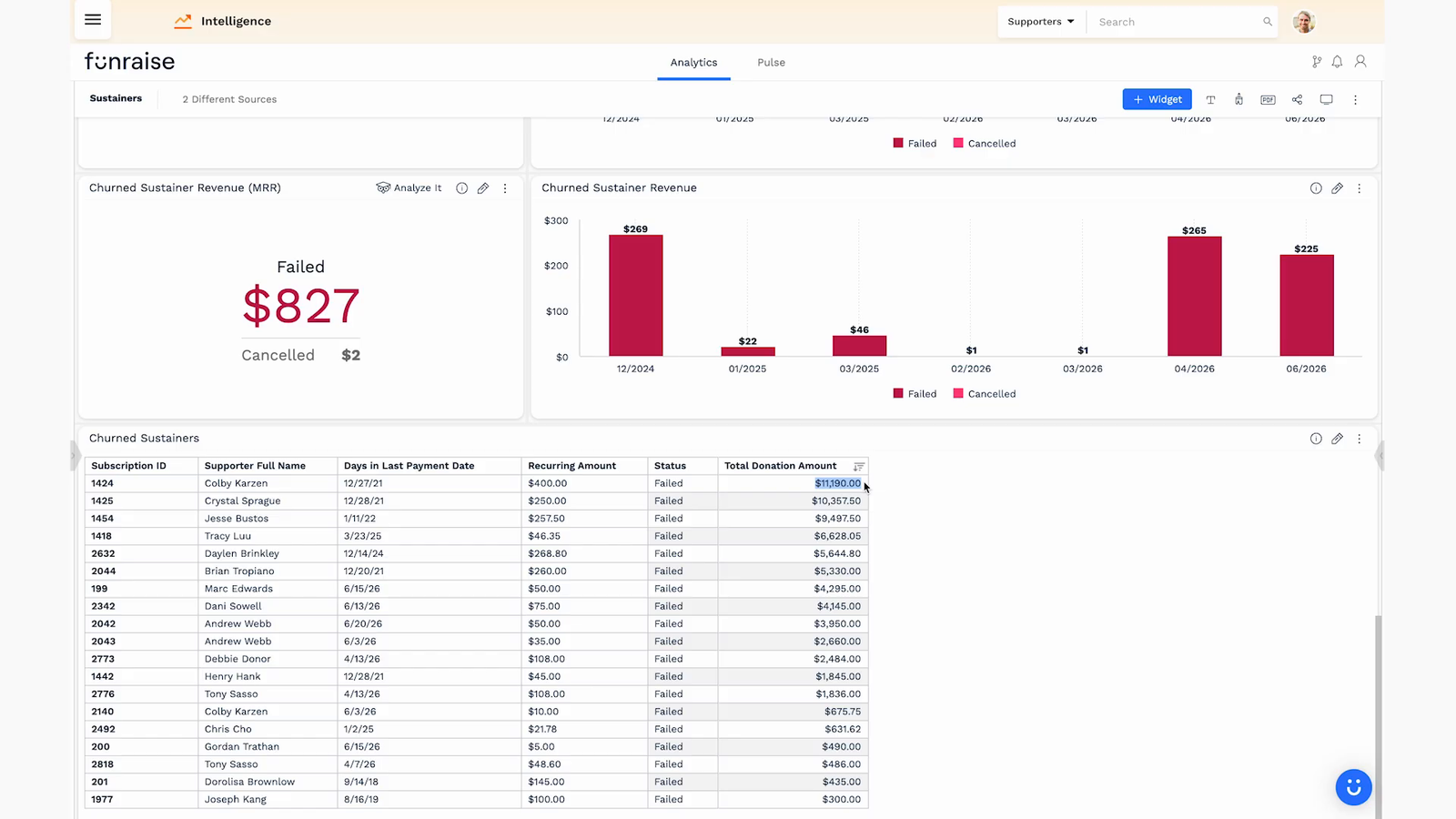
Now the uncomfortable half of the same dashboard: churn. Split churned sustainers into failed (a payment method that broke) and cancelled (someone who actively asked to stop). Cancellations you can win back later. Failed payments are involuntary churn and, frankly, unacceptable, because automated card-updater emails and dunning workflows should have caught most of them before the card ever expired. An upward failed-payment trend is your cue to go audit your automations.
4. The Campaign Attribution Dashboard
Every campaign you run should have a goal, and a way to see whether it is hitting that goal while it is still running. This is the dashboard that turns marketing from guesswork into allocation.
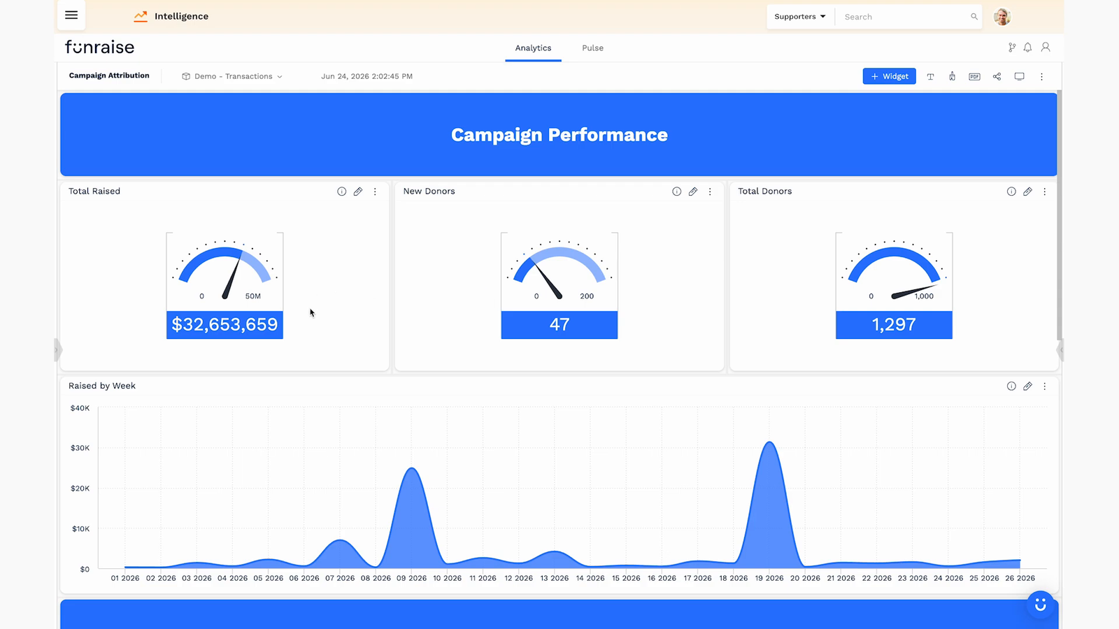
The real magic is source attribution. If you tag your links with UTM parameters, the platform captures where each donation actually came from, so you can report revenue by channel: email, Facebook, Instagram, organic, and so on. UTMs are simply the standard way every company on earth measures marketing, and they turn a vague “the campaign is going well” into a precise “we spent $3,000 on Facebook and it returned two-for-one.”
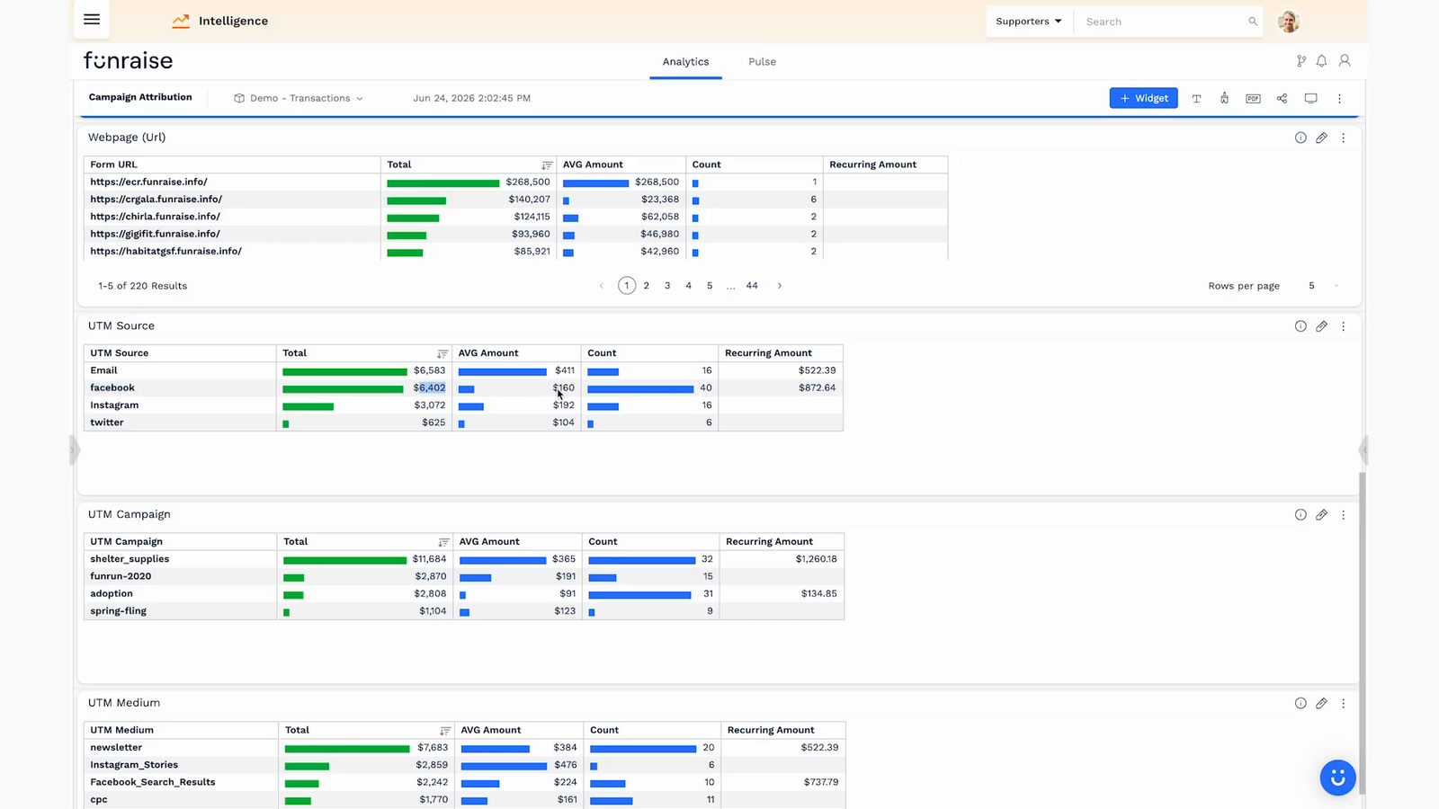
That is the point of watching attribution mid-campaign: when you can see that money spent on one channel is returning two-for-one, you can confidently move more budget there right now, instead of discovering it in a post-mortem three months too late.
How to Build a Nonprofit Dashboard From Scratch
The four dashboards above are prebuilt, but the same tools let you build your own in minutes. In the webinar, Tony built one live, and the workflow is genuinely simple. You start by dropping a widget onto a blank dashboard, say total donation amount, then add a filter to scope it (last two years, completed donations only) and format it as currency.
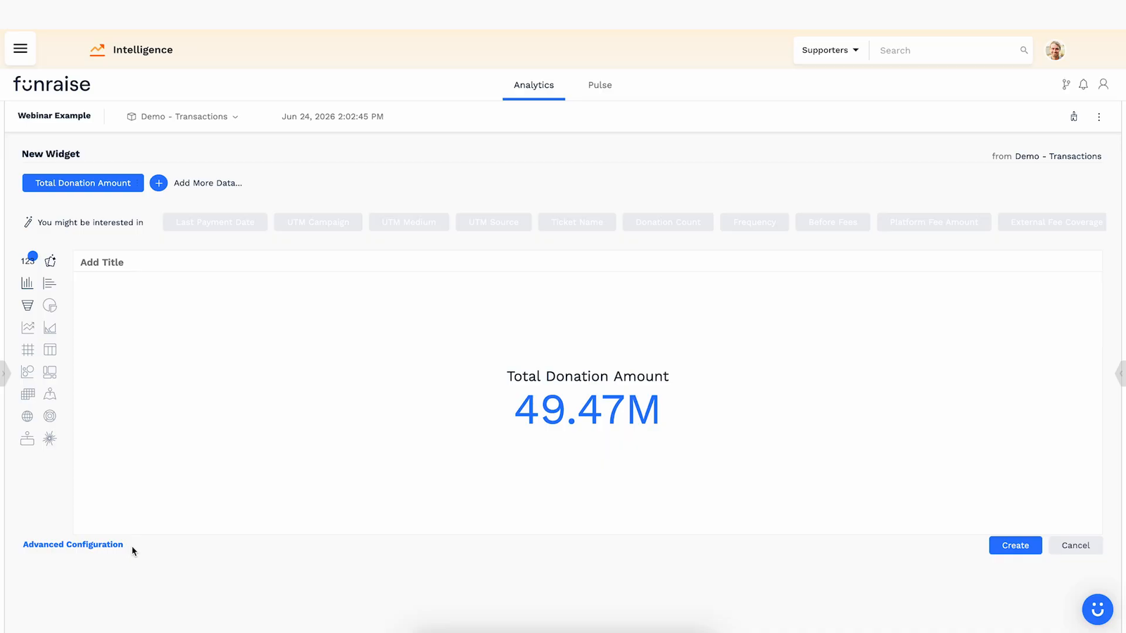
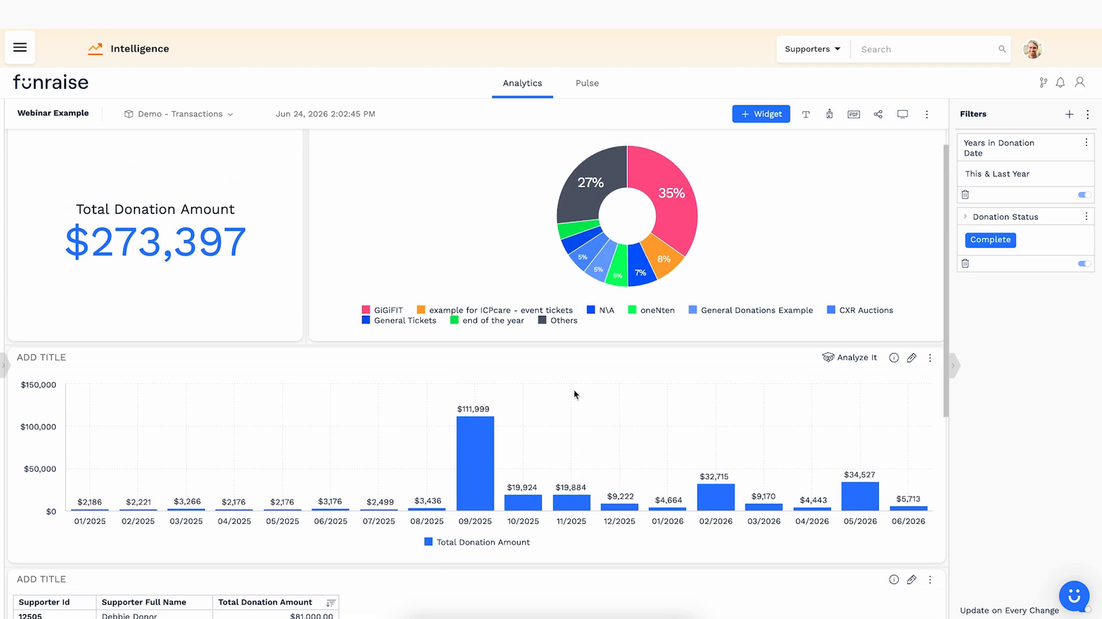
From one number you duplicate and reshape: turn a copy into a column chart broken out by month to see when revenue came in, then another into a pie chart by form name to see what drove it, then a pivot table listing the actual supporters behind the totals so you can export the raw data. Within a few clicks you have a dashboard that answers how much, when, from what, and from whom.
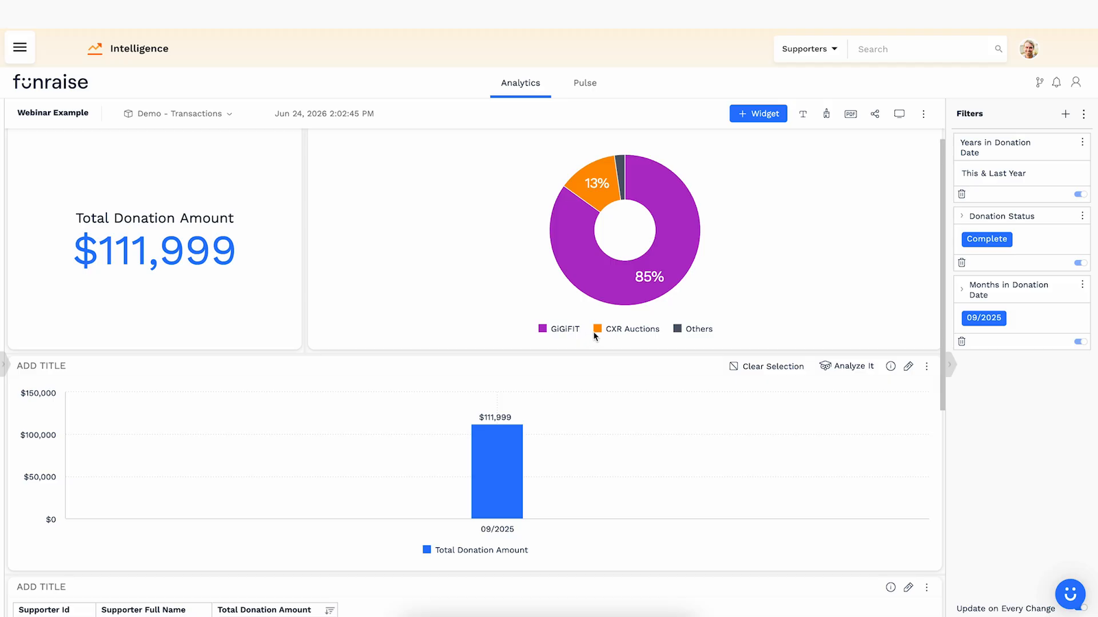
The best part is that these dashboards are interactive, not static. Click into a surprising month and every widget cross-filters to that period, so a $100,000 September becomes an instant drill-down into the one form that drove 85% of it and the 33 donors who gave. Then you clear the selection and you are back to the full view.
Make Your Dashboards Work While You Sleep
A dashboard you have to remember to open is a dashboard you will eventually stop opening. The final step is automation. Any dashboard can be exported to a clean PDF (treat it like a slide deck for your board meeting) and, better yet, scheduled to send itself to your inbox or your team’s on a recurring basis.
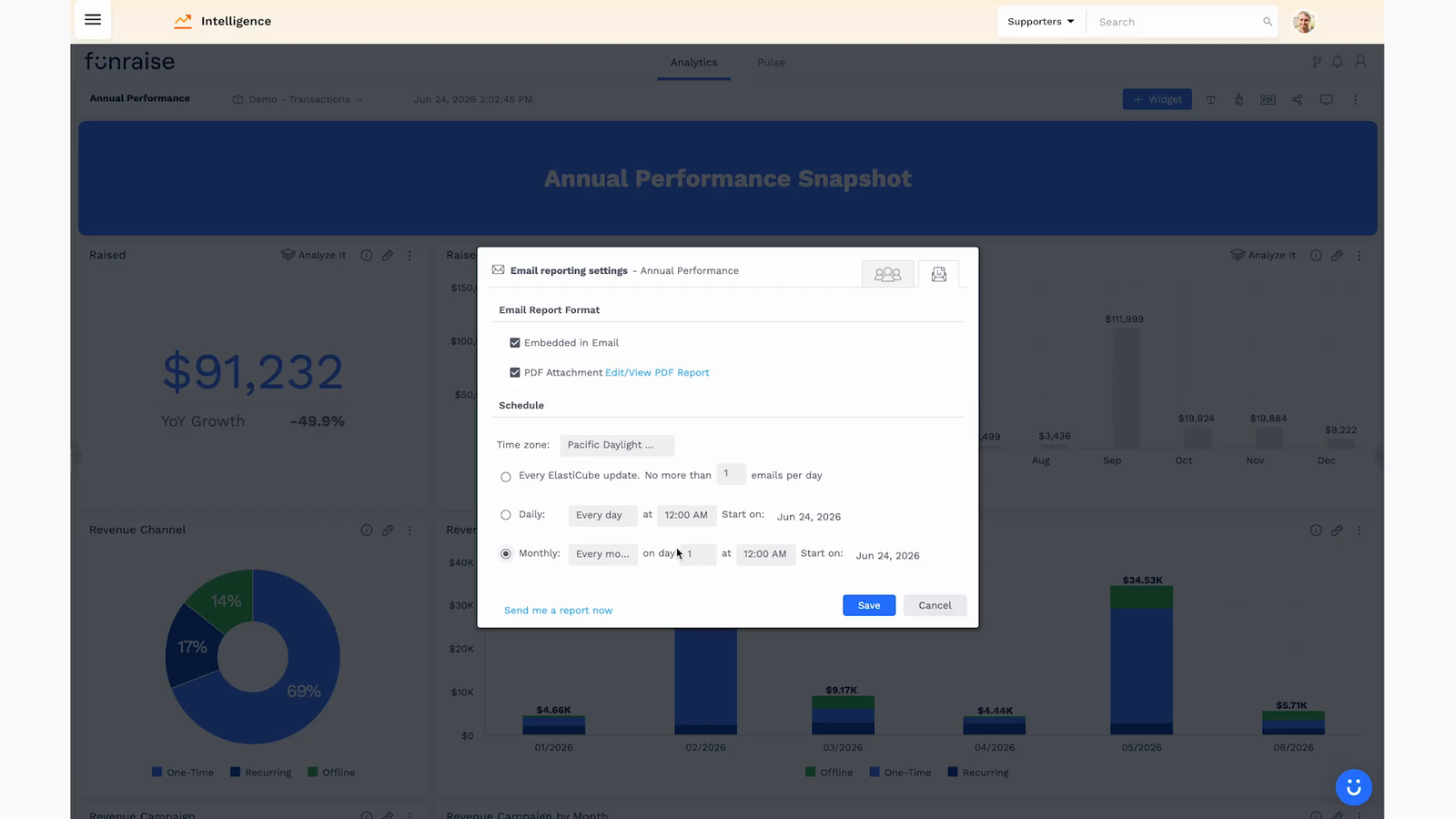
Tony mentioned he opens a custom dashboard email every single morning showing which organizations are up, which are down, and who to reach out to. There is no reason your team cannot do the same: build a daily or weekly dashboard of new donors, lapses, and campaign performance, and have it show up on its own. The goal is a review meeting where everyone is looking at the same live numbers and talking about what to do, not asking who has the latest export.
The Metrics Worth Putting on Your First Dashboard
If you are starting from a blank page, these are the nonprofit KPIs that earn their spot. You do not need all of them on day one, but this is the shortlist worth working toward.
| Metric | What It Tells You | Why It Drives Action |
|---|---|---|
| Raised vs. last year (by month) | Seasonal performance against a real baseline | Surfaces problems and wins while you can still respond |
| Donor retention rate | The share of last year’s donors who gave again | The most efficient revenue lever most nonprofits ignore |
| Revenue lost to lapse | Dollar value of your LYBUNT donors | Turns retention from an abstraction into a budget line |
| Active MRR and new MRR | Reliable monthly income from sustainers | Shows the compounding value of your recurring program |
| Sustainer churn (failed vs. cancelled) | Who you are losing and whether it was involuntary | Failed payments are recoverable with the right automations |
| Revenue by channel (UTM) | Which marketing sources actually produce donations | Tells you where the next dollar of budget should go |
Where to Start
You do not need an IT team or a data analyst to run any of this. That used to be the real barrier, and it is the one modern fundraising platforms have quietly dismantled by building reporting directly into the system. The four dashboards Tony walked through are prebuilt in Funraise, and custom ones take minutes, which is a big part of why organizations on the platform grow online giving 73% year over year on average.
Protip: Do not try to build all four dashboards at once. Start with the Annual Performance snapshot, get it emailing itself before your next board meeting, and let that one win build momentum. You can spin up a free Funraise account to see what the prebuilt dashboards look like against real reporting fields before you commit to anything.
If you want a hand connecting your data, cleaning up your donor records, or deciding which metrics actually belong in front of your board, that is exactly the kind of thing we help nonprofits with. The technology is finally ready to make your data an asset instead of an afterthought. The only thing left is to start using it to manage the future, not just report on the past.
About the Author


Benefits of Monthly Digital Marketing Maintenance Services for NGOs
Why "Set It and Forget It" No Longer Works Let's be honest. A lot of nonprofits treat digital marketing like a seasonal chore: sprint around GivingTuesday, overhaul the website every few years, refresh the email template only when open rates crater. Sound familiar? The problem is that donor behavior, platform algorithms, and device trends shift…

Fundraising Gala Tech Stack: Auction, Check-In, and Payment Tools Compared
Fundraising galas have come a long way. We're not talking about the old days of paper bid sheets and hand-written guest lists anymore. Today's events run on connected technology that ties together your auction, your check-in flow, and your payment processing into something that actually feels smooth, for your guests and your team. And yet,…

Best Nonprofit CRMs to Integrate With Your Email, Website, and Payment Stack
Fragmented tools have a sneaky way of quietly draining your nonprofit's capacity. When your email platform doesn't talk to your CRM, your website forms dump data into a spreadsheet, and payment receipts live in a completely separate system, you're not just losing efficiency. You're losing donors, and probably some of your sanity along the way.…